Text of a purple circle. The text reads," Put people first. Take a bold stand. Inspire optimism. Show why it matters."

Permanente Medicine Brand Guidelines

,

Background

In 2019, the Permanente Federation used an outside firm to create new branding for the parent company and all subsidiaries across the US. In late 2021, the branding was updated, including adding additional colors. The in-house brand center asked me to update not only the brand guidelines themselves, but also many of the examples in their 100-page documentation.

Challenge

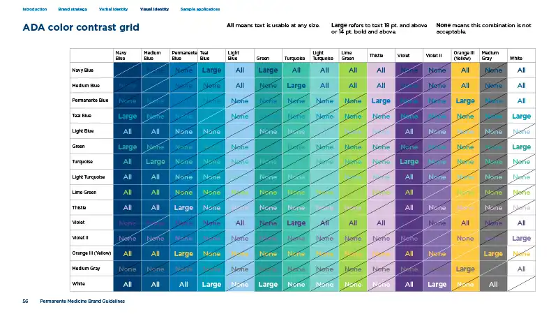
The original brand guidelines weren’t ADA compliant.

Solution

While adhering to the existing look and feel, I redesigned a good deal of the book to accommodate the new and updated content, as well as make the necessary file changes to export an accessible PDF.

A page from the guidelines with the text "Fulfilling the Promise of Medicine". The image on the page is of a cliff diver mid-air
Mission and values are as key to the brand’s foundation as their logo and colors.
A page from the guidelines showing various treatment of the graphic elements across web, presentations, and print
In a large organization, it was important to show graphic treatments across a variety of print and digital media uses.
A page from the brand guidelines showing an overview of logos, typography, colors, graphics, and photography styles
Due to the needs of such a large organization, the guidelines were extensive and detailed.
A page from the guidelines showing a chart of usable and unusable color combinations for ADA compliance.
Accessibility and ADA-compliance were of paramount importance to the organization.